For the second semester we have been set the task of creating a minimum of 2 formal typology’s. To then move on the typology’s we will then be able to experiment with our own images and layer them over the top to create a stacked image of all of the typology images layered over the top.
A typology is a photographic record of the same types of objects but different ones. Such as it could be a range of lamp posts or lights but there are in the exact same place within the frame every time. One set of photographers, Bernd and Hiller Becher created typologies based on buildings they used factual lighting to make it not pretty but documentary. There buildings they have used are not built for style, but they are there for a purpose. There are a few aspects that you need to make sure you include when creating typologies, theses all need to be the same to create a successful typology.
• Lighting
• Camera
• Settings
• Profiling
With the four things listed being the same, for the lighting you will have to keep the same to make sure that the detail within the object is never lost. Keeping the camera, the same will help as the same colour RGB will be the same rather than changing between a range of cameras creating it with assorted colours will make it look out-of-place. The settings will obviously have to stay the same so that you don’t get a to darker image alongside with brighter ones. The last one is the profiling having the object placed in the same part within the frame making it more symmetrical over the overall typology.
With then putting the typology into a grid it has three factors of what it does for the images theses are, Show differences, neatness, easy. With these three factors you can see what the differences are between each object you have chosen to photograph. With the neatness it will show that you care how you presented your images to show off your photography in a professional way.
Here are a few examples of the work of Bernd and Hiller Becher from the 1959-80s.


These four examples are taken from http://www.tate.org.uk. Out of the four images I have chosen to look into detail with the first one, this being the Water Towers from 1972-2009. The images that are included within this typology have been taken over the space of 30 years but it was first printed in 2013. In this typology it is showing different types of specific types of industrial architecture this is with all four of the examples, but with this certain one the images have been taken in a range of different locations across Europe and the United States Of America.
For more research I have gone on to look at the work of James Mollison, as we have watched a documentary on part of his work I was quite interested in this photography work. James Mollison has created a wide range of projects such as
• Where children sleep
• James and other apes
• The Disciples
From the documentary these three examples were shown, all three caught my eye as they were all unique studies he had created. The first one being ‘Where children sleep’ this showed simple portraits of children making them all look the same, but with a twist he added a second image this being their bedroom. James Mollison did this to show the difference between what the children look like and what their room are like. It helps to show the contrast between children within the world, to show some of his work I have included two examples that are completely opposite to each other to show the dramatic differences between the two children and their bedrooms.


With these two examples above it shows the different between two 4 year olds where they live and what their lives are like. This may not be your typical typology, but it is still classed as one showing how different things can be. With the first one of these image, the 4 year old from Rome, he is a Rome traveller boy who slept outside on this mattress. The second one is of a 4 year old called Kaya she was from Japan and loved to dress up as dolls. Just from these two examples you can see how much of a drastic change there is from children around the world. I was drawn to this work as he has used a simple passport photo to show how the children look but then has gone more into detail with how the children live, making people read between the lines making them think to look different at how people dress to the way they live. More examples of this project can be seen at – http://www.jamesmollison.com.
Second project is ‘James and the other apes’. For this project this more links back into a more formal typology showing the work within a grid format. This project was build-up of passport photographs of apes faces, having them close up to see the difference between the facial features. It helped link back to the history of how human faces were formed looking into detail of apes as that is where we involved from.
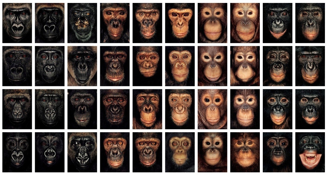
This typology is all the images James Mollison has taken put together as one piece. With looking at this you can see the range of the faces and how the facial feature changed with in each one of them. James Mollison said within his documentary that he had photographed them to show a point of the apes losing their habitats and family. He used a Polaroid camera to take the to get the photographs.
The last project which I mentioned above is ‘The Disciples’ this is quite simple project, he has based this on going to concerts and looking how the fans have dressed. With him looking at the fans he has been able to look at grouping them together to make a small game out of his images. The game would be to guess the artist who is in concert, by how the fans have dressed for the event.


The four examples above are showing some of the quite obvious fans flowing the person who is performing within the concert. I have included Lady Gaga, Oasis, Katy Perry and Sex Pistols. All of the fans taken with in the photograph are dressed up from at least one of the looks that the artist they have gone to see in concert has dressed like at least once. James Mollison took 3 years photographing fans and became fascinated by the different tribes of people who turned up to each concert, he was interested by how people emulate celebrity to form their own identity. James Mollison also said that they came together with surrogate families reliving their youth or trying to be part of the scene. This information has been taken from his website with the synopsis that has been wrote about the project. http://www.jamesmollison.com. My opinion of this project is that it was a unique way of creating a typology as it’s not an obvious way of creating it as the people are quite different from each other but have been placed or grouped together as they are all dressed in similar way and are quite obvious of who they are trying to be like.
Brief
For the brief we have been set the task of creating 2 sets of typologies that include no less than 9 images, they must be formal. As an experimental image we have to then layer them all together and produce a A2 print of the typology all together to show the difference between them all in one image.
Ideas
Once looking at typologies done by other people it got my thinking of what I could create for my own typology. I have chosen some that can be done on location and then some that can be done in studio. We where advised not to do any in a studio environment as it would be to easy to create and it would not challenge us, however the ideas I have I want to see what effect the image would create and to see the difference between the products/items I would be using. 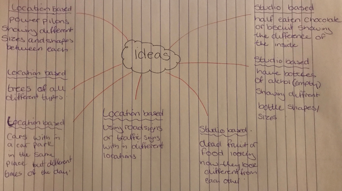
I have come up with three ideas within studio and four ideas of location based typologies. First ones I will be talking about are the studio ideas:
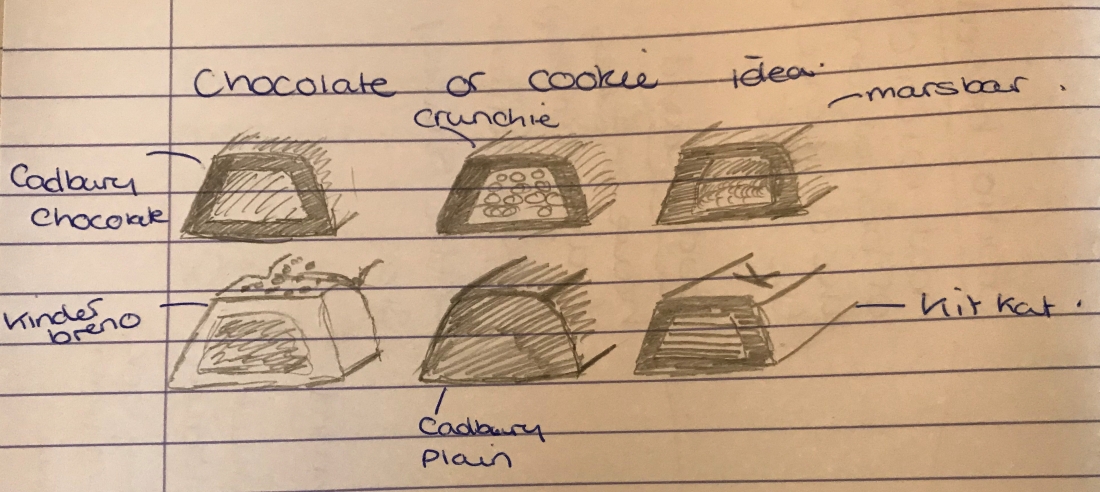
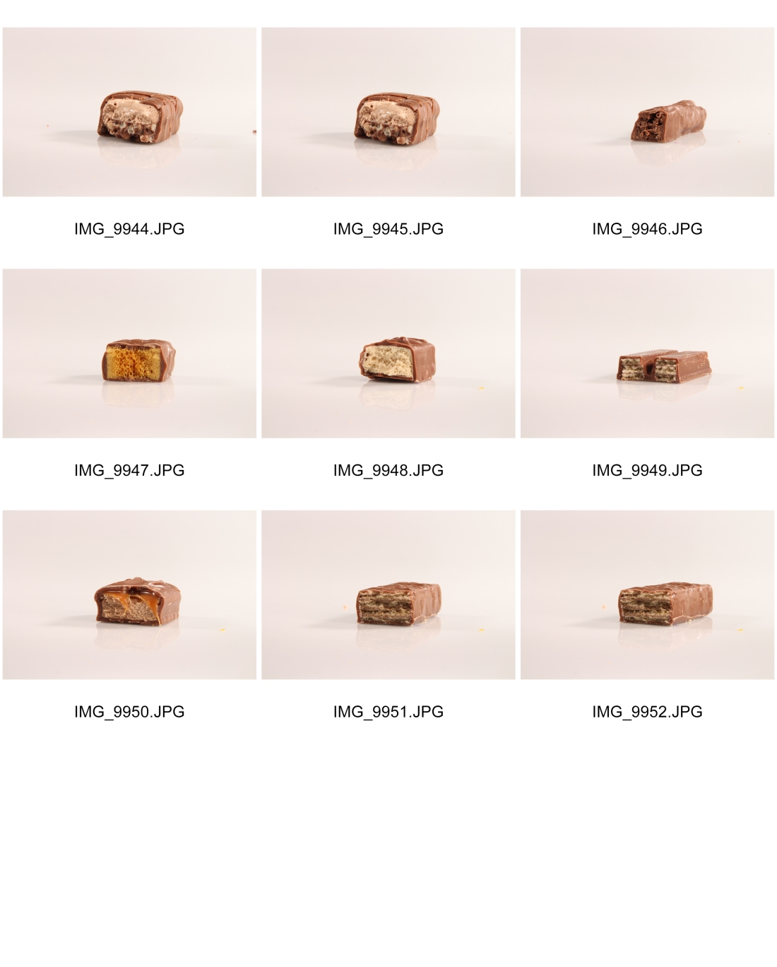
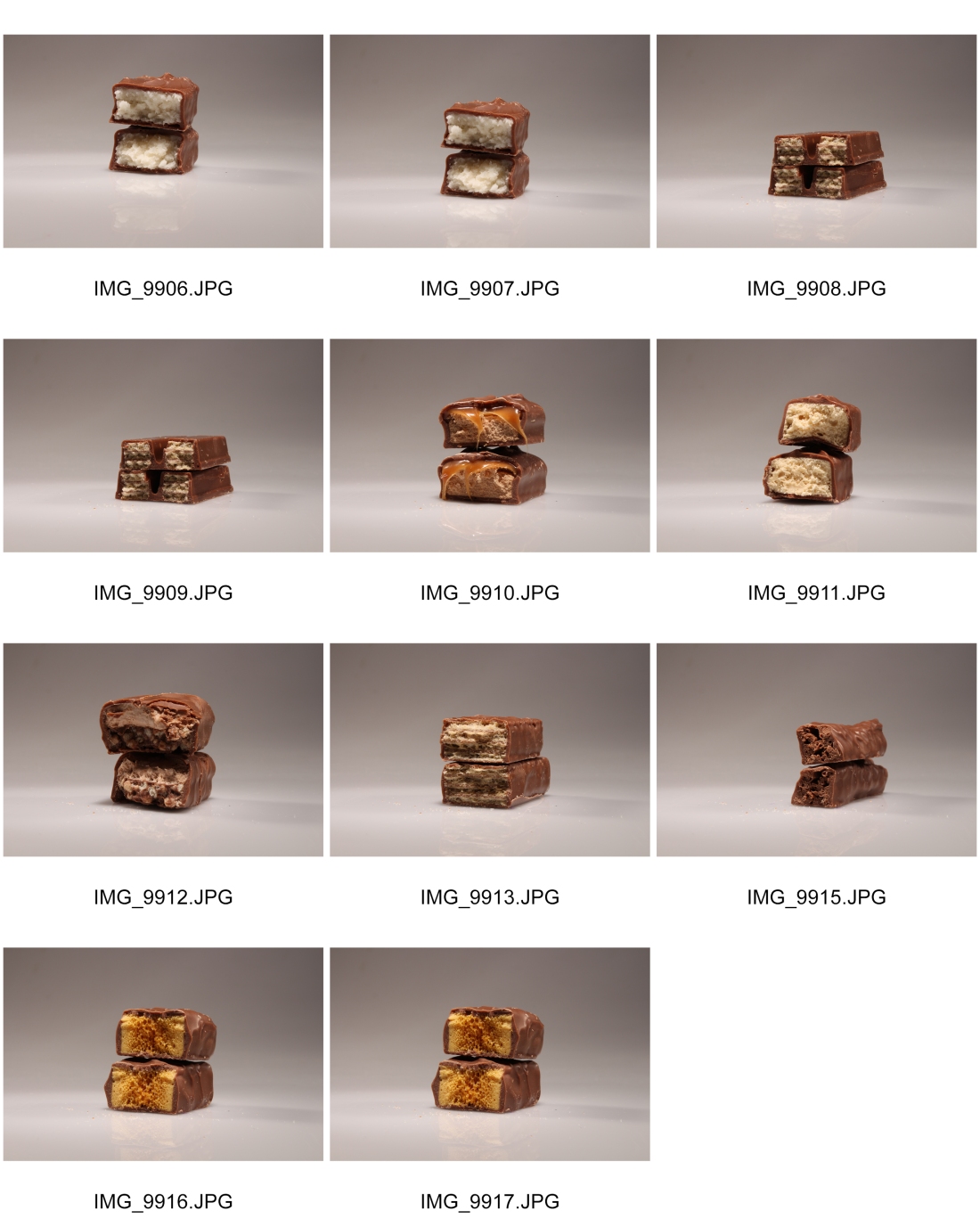
1 – Chocolate/Biscuit (Studio based)
For this first idea I am wanting to look at breaking in half chocolate bars or biscuits looking that the inside of them, seeing what details are found within the layers of the food. Ones that I think will work effective for the typology are –
- Mars Bar
- Aero
- Crunchie
- Whisper
- Twirl
- Rolo
- Twix
- Truffles
- Turkish Delights
Reason I have chosen theses nine chocolate items is, they all have different aspects that they have been made with, for example a Rolo has caramel in the centre with a thin chocolate outline, but then in comparison a Crunchie has a hard centre of Hunny comb that will have a range of detail within the chocolate bar. I have included a small design diagram below.
2 – Glass Bottles (Studio Based)
This second idea is about collecting empty glass bottles and creating a typology to see the different sizes and shaping, as people may just look at the brand and not the detail of the bottle. There are some bottles that are thinner than other and have a various amount of labels on the bottle. I would leave the labels on rather than taking them off so the people that looked at the work would know what drink they where. For this idea I would have to make sure my lighting set up was right so that when taking the photographs of the bottle I do not get a light flare anywhere on the bottle. Reason I have chosen this as a studio based idea is that it would look more like a commercial image rather than being put into a location where you would normal find the product, but my aim is it isolate the bottle and have it the only thing with in the image.
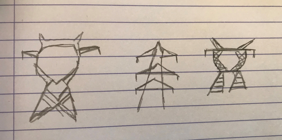
3 – Power lines (Location Based)
For the first location based idea I have come up with looking at Power lines, I have chosen this as one of my ideas as it would be an easy task to complete as they are everywhere. One thing that I do not like about this idea is that it is to simple but it could be taken further and create more ideas from this one. I think it will be interesting to see if they are the same or if they have been built with changes to each one.
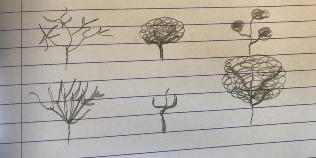
4 – Trees (Location Based)
Idea 4 is the second idea I have got for a location idea, it was to look how trees are formed and where they are placed and what are surrounding them, even if its not the same trees it would be to look at the range and styles of trees that have grown around us. I may even more this on to look at the smaller details within the tree. One creating the tree typology I will look into getting more detail on the bark of the tree showing the changes of ones that are freshly grown and the ones that have been planted years ago, which are showing their age.
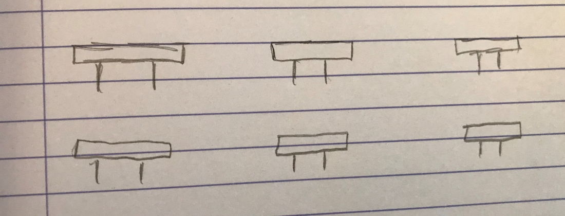
5 – Street or Road Signs (Location Based)
The last idea I have is to look at road signs, I have chosen this as one of the ideas as it could be quite unique to show how much they are similar rather than different. The only thing that would be different between them all are the names that are actually wrote on the sign. On the other hand there will be another difference this being the quality of the sign some may not be as clean as others depending on there location. For this idea I will have to make sure when I am taking the photographs that I make the composition the same rather than having signs closer up than others and others further away.
First Typology (16th February 2018)
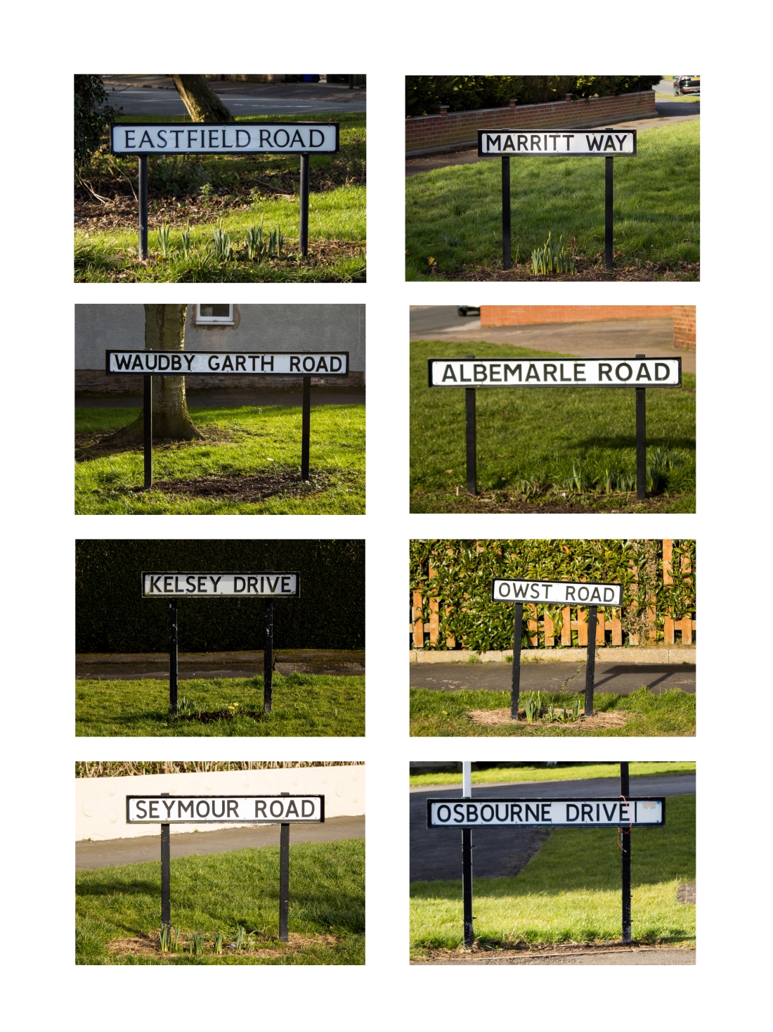
The first idea I have completed is the Street Sign idea. For this idea I have gone out and taken photographs of the street names from where I live. One thing I wanted to do in this shoot was try and keep the setting the same as possible, however this was not possible as the sun was brighter in some places. Below shows my shoot out come


With this shoot I have taken simple images of the street road signs to start of my ideas, getting my self to think about ways I could create more of an interesting outcome. However with this shoot I believe it has worked quite well as I have thought about the positioning within the frame trying to get the positioning the same every time. In some images I have gone to close to the street sign cropping the image down slightly, the ones that are like this I will not be picking to put into the typology as they would not work within the symmetrical look I am trying to create.
For this shoot I have tried to keep the setting the same as much as possible, however with the sun shining on some of the road signs, I have shortened the shutter speed time so it lets less light in. The settings that I have used are –
- Aperture – F5.6
- Shutter Speed – 1/125 and 1/200
- ISO – 100
The images I have had to change the Shutter speed on are IMG_9764, IMG_9766 and IMG_9771. You can see within the contact sheet that once I had turned increased the Shutter speed the image has become slightly darker and has taken out some of the lighting that was coursing the image to become to light. The last thing I have kept the same with this shoot is the length of the zoom I have used for each photograph. Throughout the shoot I have shot at 55mm on the lens to maximise the zoom so I could get close up as my lens took me. The lens being 18-55mm.
To make the final typology I have created a template within Photoshop to place my images into. Before I put them into the template I have made slight adjustments to the images in camera raw. The next part of editing was to do some straightening up of the signs as they where bent for either people driving into them or the mud they are sat on has given way to one side. The last step of editing was to change the images to the correct size to fit into the template I have create. By doing this I have masked the space to be filled with the image and placed it over the top of the photograph to resize. This is so I only get the part of the photograph I want rather than just having everything else squished into the image causing distractions for the audience. Print screens of edits can be below.


Final Piece
Experimental Final Piece
For one of our out come we have produce an image that has all of the typology images layered over the top of each other. I have used the images above in my first typology to layer them over the top of each other changing the opacity and the fill setting within Photoshop to create this experimental piece. This can also be created by turning the lens when taking a single images but you would not get the same effect as what I have created below.
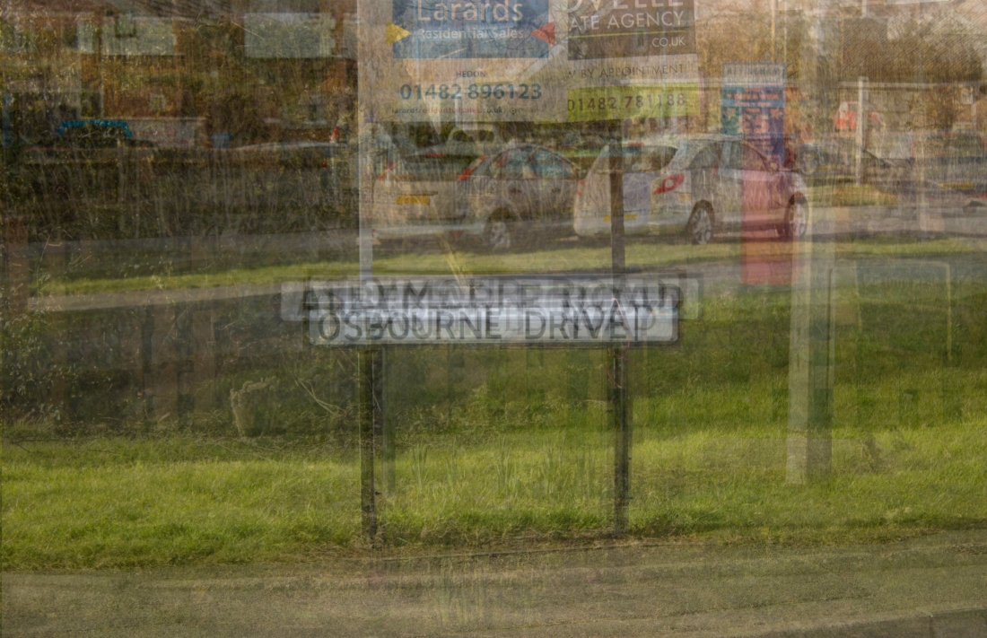
This experimental photograph takes us back to the work of Bernd and Hiller Becher. However they did not create the actual over layered pieces of work this has been done by Idris Khan creating a photographic print of all of the images layered together. Below show the ones that he has created from Bernd and Hiller Becher’s work. I have found theses images from this link – www.saatchigallery.com (full link can be seen in bibliography)


Second Typology (19/02/2018)
With my second typology I have moved on to looking at the logos of car brands, looking at the difference between the colours and sizes. This typology is not one I have designed but it is one that I thought of while creating the street signs, I came up with this idea from how many different types of car makes there was around where I live. With this shoot I wanted to keep the settings and the angle of the photographs the same.


There are a few problems with this shoot, one being that there is not enough car logos to create a 9 piece typology of them. There are a few down sides to this shoot, these are that the images are quite out of focus so they do not have a high quality feel to the image and the detail drops off. Another point is that some of them are taken from different angles, this would not work well within a typology as they will not look symmetrical. It would distract the audiences eye that they where slanted and not straight. To carry on this idea I would have to reshoot and make sure that I get everything correct and the right amount of logos. One thing that could also be improved is when taking the images make sure the car logo is clean and then there would be less editing to do within the final piece.
Reshoot Car Logo (20/02/2018)
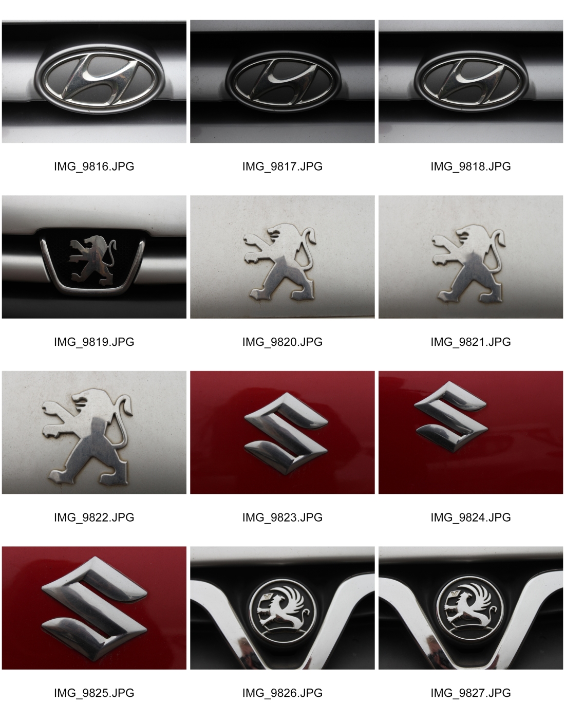
Once looking over the other shoot I wanted to get a few more images of car logos so I went out and get a few more some are similar to the other shoot but these are more focused and the angling is better than the others. I wanted to combine the two shoots together to create one typology. One point about this one would be that it would be a smaller one that the street signs depending on how many images I have that are of a high quality to include within the Typology.
Final Image
![]()
The typology above shows the final piece I have created on the Car Logos, there is one down side to this image is the quality of some of the logos they have let the over all image down as I should of cleaned them up, but then it would make the images unrealistic as them being car logos. Some of the sizes of the images may not of worked as I should of kept to either photograph the front logo of the car or the back logo rather than mixing between the two as there is a size difference between the two. Another factor of taking images of the front logo you get the grill on most cars so it would add more detail to the image. This would be something to look at if I was to recreate another typology on Car Logos.
Experimental Final Piece
Once having all of the images together I have done the same as what I did for the first typology. With this one with the images having a lot of silver colour to the images they began to run into each other. But you can still see each layer of the image thought out. ![]()
Once looking at the image it did not seem as dramatic as the other I create of the street signs so of one way of improving this image was by print screening the image in a stamp form using the keys ALT+CTRL+SHIFT+E by doing this it created a stamp of the over all image to be able to edit it as one. I added an adjustment layer of contrast and brightness. 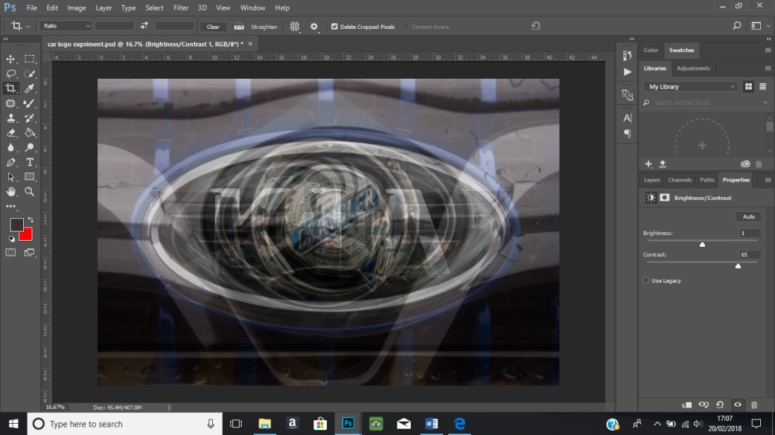
With doing such a simple edit it has brought out the blue that was in one of the images making it have more colours within the over all piece rather than having just silver. Increasing the contrast has added more detail to the logos which all layered on top of each other.
Final piece
![]()
Third Typology (28/02/2018)
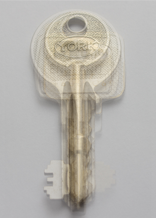
For the third idea I have come up I have used keys as the main object within the shoot. I have chosen to look at keys as a typology as they all do the same job but come in different shapes and sizes, to fit a range of doors. I have used a range of keys that are used for opening doors, safes and letter boxes. I have chosen to create a typology on keys as they all have different cuts and ridges within the engraving on them, some of them have the brand of the company engraved into the key other have there serial number on. They all have different aspects to them which make them all unique.


For this shoot I have used natural light from a window, I have placed it as close as possible to the window so that they would look as true colour as possible but as a procuration I have included a grey card so the background will be come a true white rather than having a blue tint to them as you can see from looking at the contact sheets. The first few images where taken with out using a tripod so they where coming out of focus so to solve this problem I have used a tripod to keep the camera still also so the camera will stay in the same place only thing that may change is the positioning of the keys as I did not manage to line them up correctly every time but this can be changed when put into photoshoot to create the final typology. With some keys I have changed which way round I have them, this being where the engraved part is pointing I have done this as with some keys that I have used have more detail on one side to the other. However when creating the final piece I will be keeping as much as possible the same so the side of the keys will be the same rather than having a few pointing to the left and other to the right.
Final Image 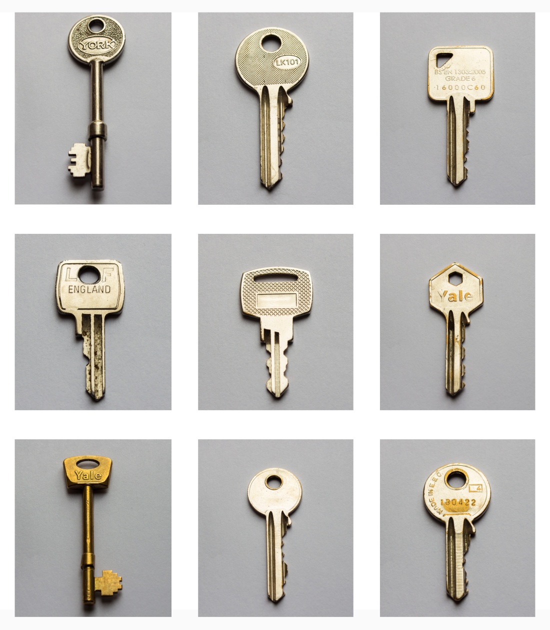
The image above is the final typology I have created, I think the idea was good as you can clearly see there are a range of differences between the keys. To me one thing that has let this shoot down is one of the colours of the keys being gold instead of matching the rest and being silver. In some way its not to be of a deal as it adds more differences between the keys that they are all different colours. Once having it together in a typology you can see that the details that make the keys similar but then opposite to others.
Experimental Final Piece
Once I had the typology completed, I have created an experimental piece of it. There are certain aspects of the image that let it down that the keys are all the same colour so no one key stands out around the rest. For more experimentation I will be creating another three experimental pieces that try to enhance the different keys.
Extra Experimental


With the extra experimentation I have thought about how I could create each key to sat out. One way I have tried to create this is changing the layering of the keys I have moved them all away from the centre so that it goes left to right with the keys which makes you be able to see each key even though they still might be faint. The next step I have done is used a free transform tool of pinch, this is shown is experimental three, by doing the pinch effect it has created a small amount of movement within the image making people work from the outside in. With the last one I have removed the pinch and have changed the saturation of each key so they became gold rather than silver, by doing this it has a stronger contrast between the background and the key. Out of all the experimental edits I have created the one that works the best is the Experimental four by the colour being changed, reason I believe this is that the keys have a stronger colour and they have different tones of gold with them so they hand out against each other better. To move this forward more I would go back to the first experimental extra where they are simply overlaid over the top of each other but keep them as gold and see what the out come looks like comparted to the other.
Fourth Typology (08/03/2018)
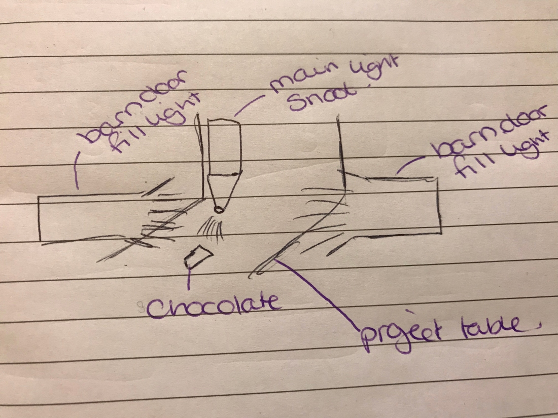
The fourth typology I have created is based on one of the design idea I have drawn up from the first ideas. For this typology I have created it within a studio environment, I have used a three and four light set up with the shoots I have created. I have ended up with four shoots all with different aspects about them. There is only two shoots that shows a traditional typology, where everything is the exact same the others are experimental shoots that I have moved on from the first shoot.
Shoot one


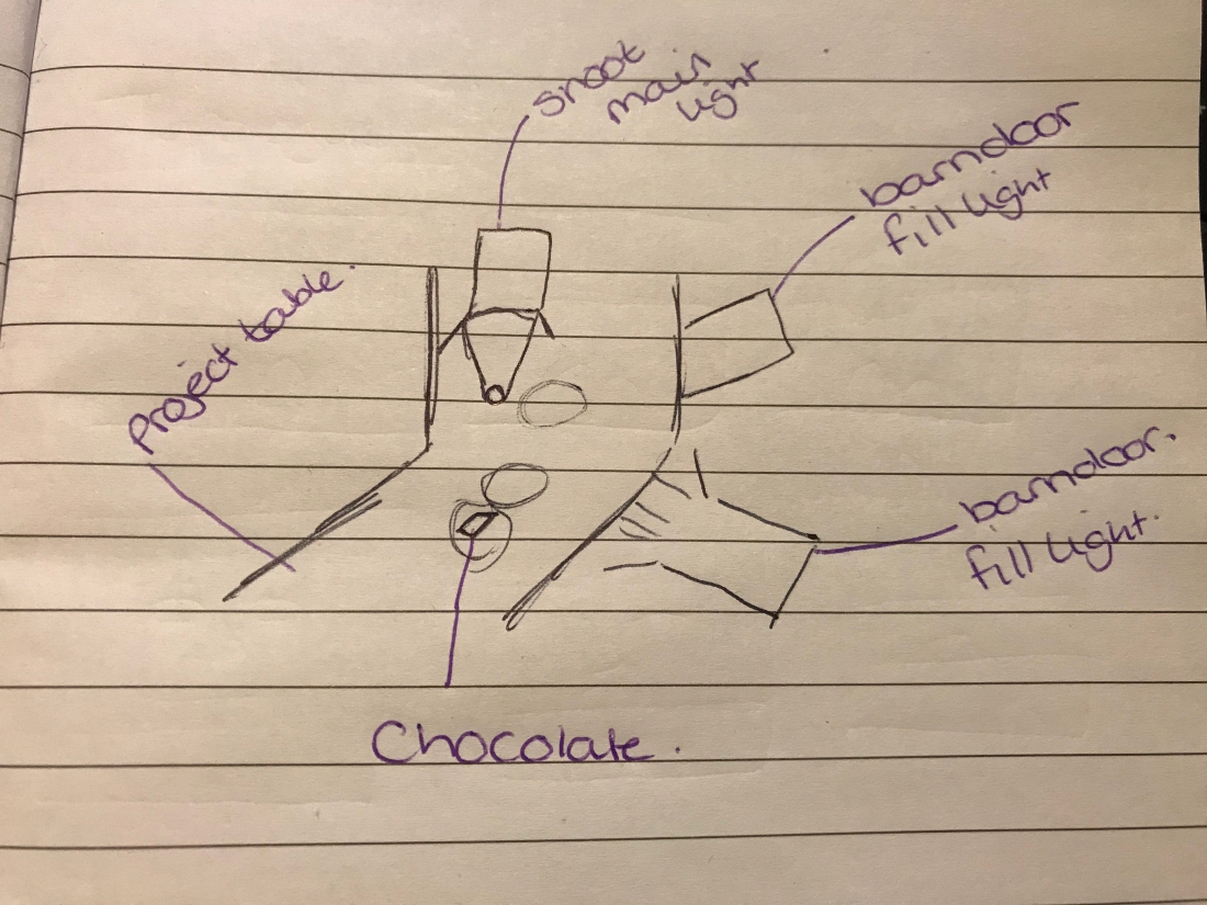
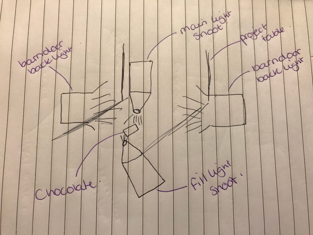
With this shoot I started out by back lighting to the project board, this created some problems as I did not have the lights positioned correctly. The results from having it back lit and lit from below can be seen within the first half of contact sheet one. Once coming across this problem I moved the lights so that they where angled across the project board so that the back part of the project board lit up. This can be see with the rest of the contact sheets. To add more detail within the chocolate its self I have placed a light above the chocolate so that the detail is brought into light. This was needed so that the main part of the typology could be seen. One problem that I have with this shoot is that the background is not a white colour it is more of a grey, this lets this shoot down and does not create a good enough out come for a typology.
Lighting Diagram
Reshoot one
Once looking at the images I have created from the first shoot I have thought about the aspects that could make the background more white –
- change the power of the lights
- select a different modifier to go on the light
- move the positioning of the lights closer to the project board
- under expose the image within camera
With theses factors the one this seems that will work the best would be to increase the lighting power so that they have a brighter flash over the background. I would turn two of the lights power up theses being the background lights which are coming from the sides of the project table. The results of this shoot can be seen below.
I prefer the out come that I have got from increasing the background output as they have make the chocolate bar pieces stand out more from the background making it the only focus within the image. There are a few parts within the images that have to be removed these are small blemishes.
Lighting Diagram
Final Image
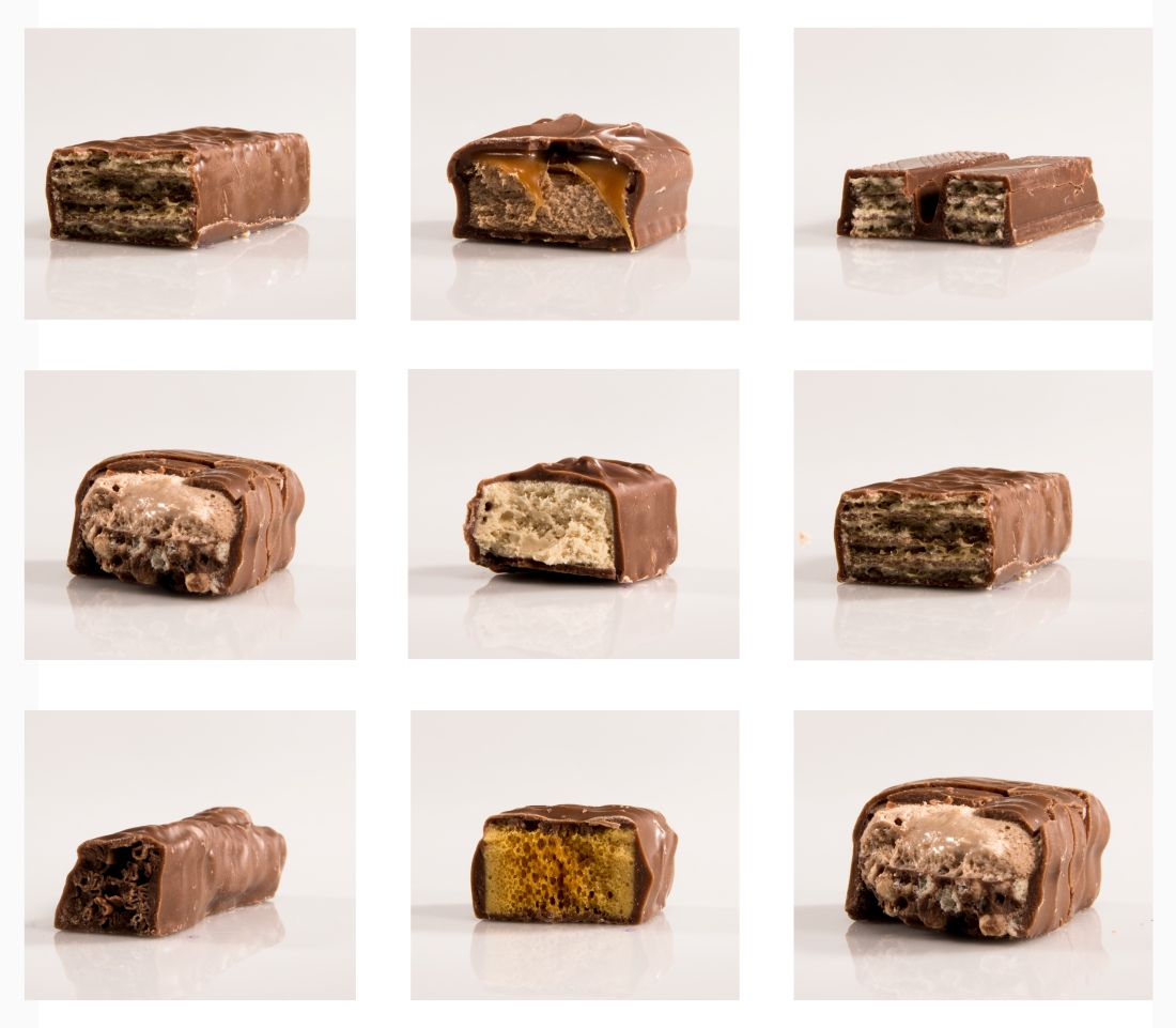
With the final layout of the typology I have included two images that are the same as another within the typology I have included this as a extra chocolate as I only had 8 within the shoot but we needed 9 to meet the brief as the minimum is 9 image involved within the typology. With having only 8 chocolate bars to begin with it lets down the typology as I would not be able to put this forward for a final piece but it is good to show my experimentation and idea being followed through.
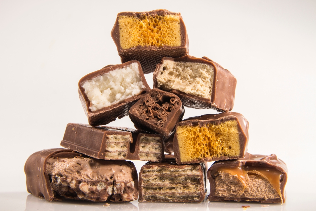
Final Experimental image
Shoot Two
For the third shoot I have created before the one before, I should of reshot the images however this is just an extra part of experimentation. With this shoot I have used both parts of the chocolate bar, and placed them on top of each other by doing this it only adds extra detail and more parts to the image.
With this shoot the part that lets it down is the background colour as it would look better in white rather than a mixed grey tones. Even with this down point they are all a crisp clear images that have met the brief of a typology.
Final Piece
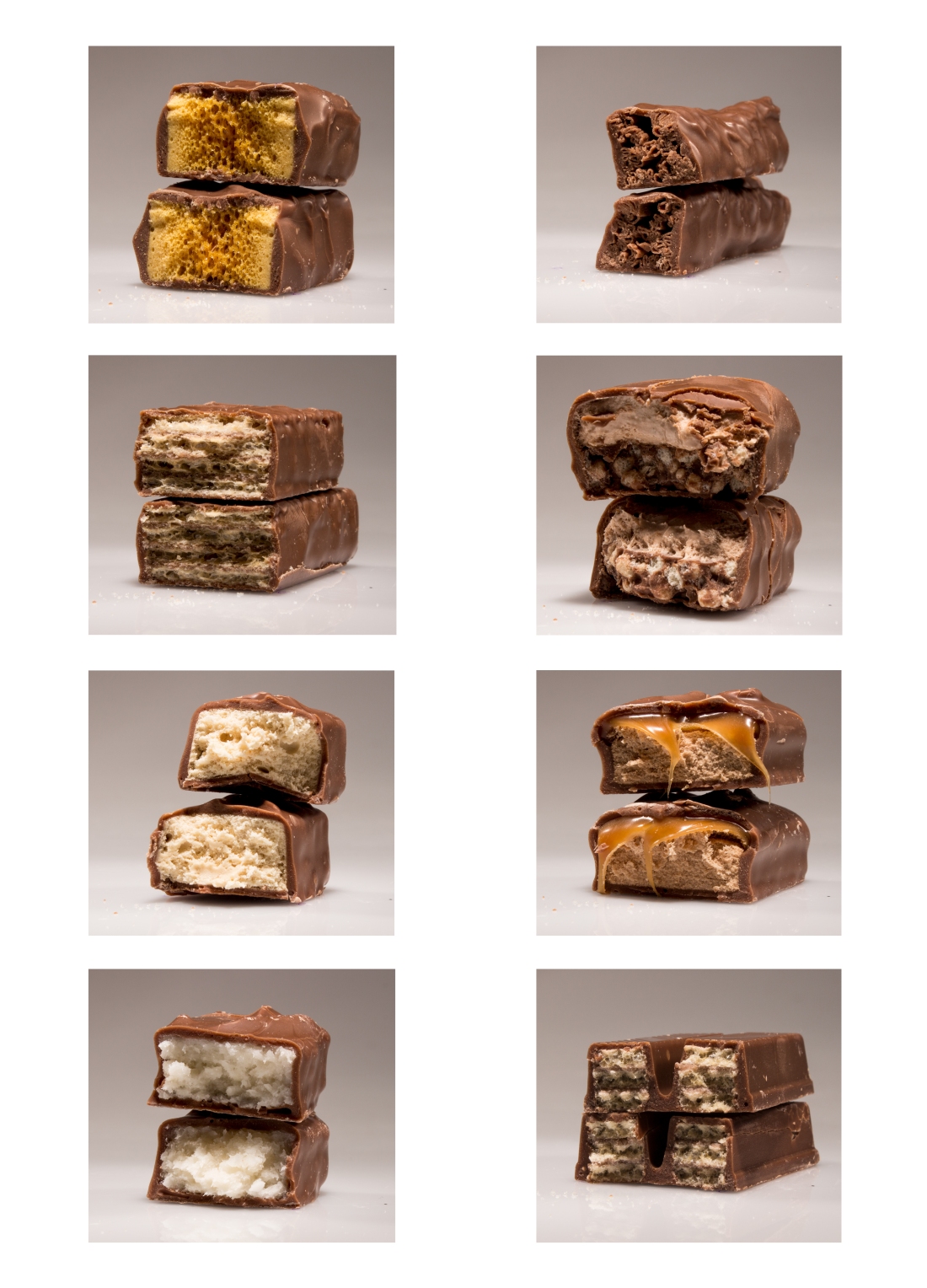
Once putting the final piece together, it has shown the consistency of the background colour that they are all the same, the positioning of the chocolate is quite similar as well which makes you draw more attention to the chocolate bars. The middles of the chocolate bar have come out quite well and you can see the full detail that I was hoping to get within the image. This could be a final piece for this idea of the chocolate, it will all depend if the shoot I have created with the full white background included would look better rather than the mixture of the grey tones.
Final Experimental Piece
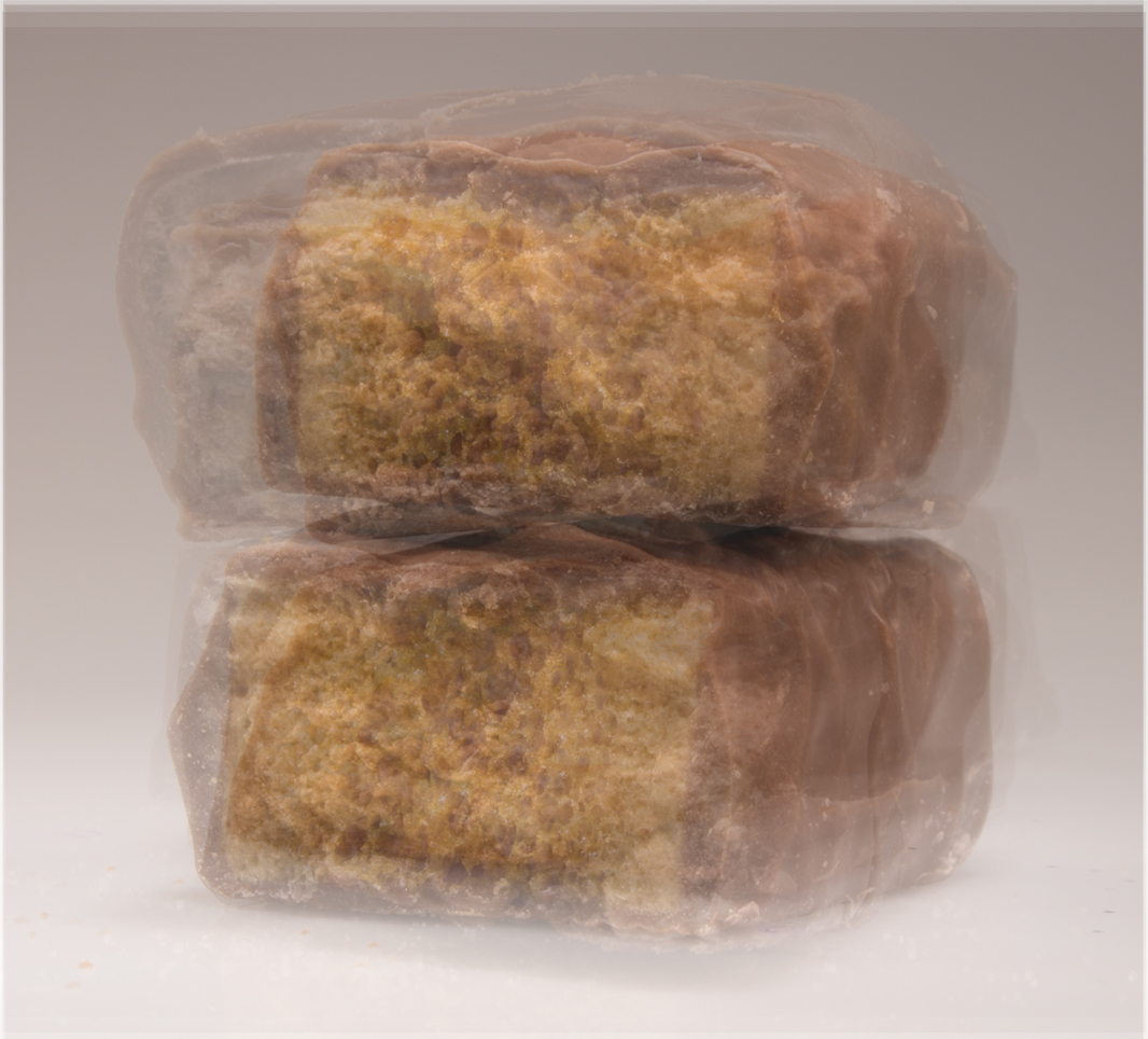
The down side with this idea is that the chocolates are all the same colours so when they are all layered together you do not get the effect that would of worked well if there was white chocolate included within the shoots. This is something that I did expect to happen however it also may be the problem that I have put the most detailed image of the chocolate bar at the top of the image, which has in some way taken over the image rather than having all the aspects I thought I would have with in it.
A thing to look at with this set of images, I could take a closer crop into the image and only have the centre of the chocolate bar within the typology so it makes people question as to what the bar is. This will be something I will be trying with one of the other shoots that I have produced to see which outcome works better.
Shoot Three
For this shoot this is where I have taken typologies in my unique was by not creating a typical typology that I have created before and that are not seen often. For this shoot I have added a light to the three I have use before within the shoots, I have added this as a typology as there are nine types of chocolate within it. But it is within one image rather than having it in each separate image.
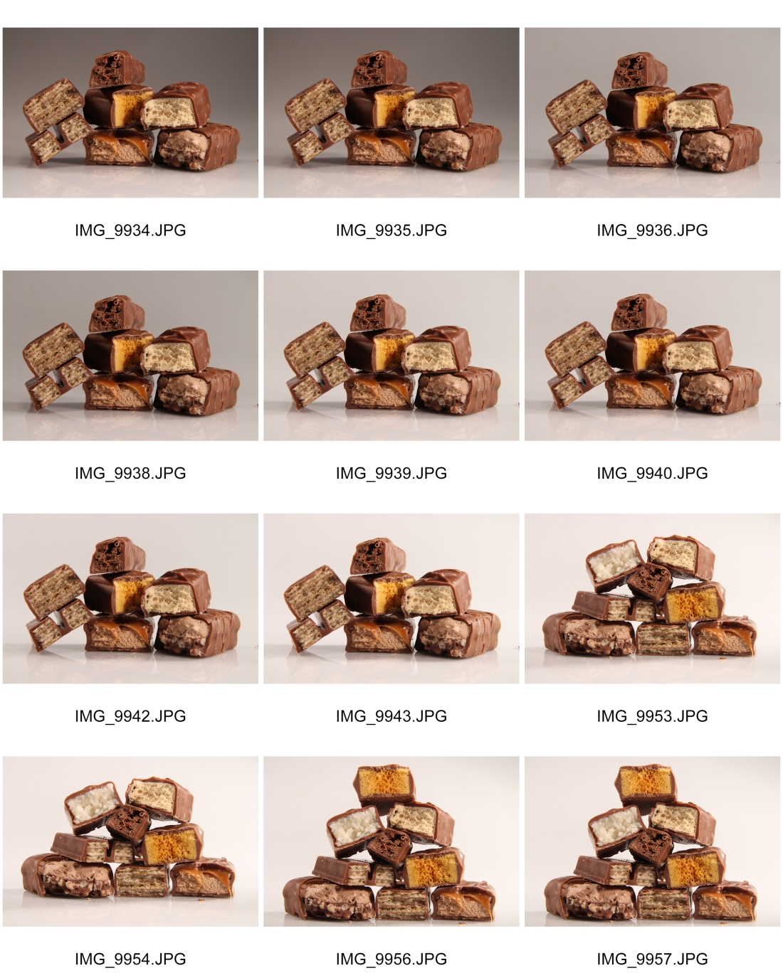
Lighting Diagram
Fifth Typology (09/03/2018)
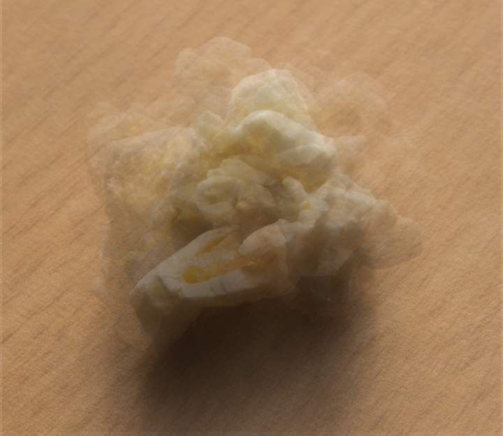
The fifth typology I have created is using the same idea of the chocolate bar shoot, but it is with popcorn. I have used a sweet bag off popcorn and picked out some of the pieces that have the most interesting shape. I have chosen this as they are all the same object but different within there own way being bigger or smaller than others, or even half cooked or over cooked. For this shoot I have used the same set up as I have with the keys using nature light from the window. I have used a macro lens for this shoot, reason behind this is so that I can get the smaller details within the popcorn. Settings for this shoot are –
- Aperture – F9
- Shutter Speed – 1/125
- ISO – 100


I have used the grey card again to get the correct white balance, as it is shot from natural light this could change at any time. It can be seen within some images that the table comes slightly brighter towards the end of the shoot this is something that I could not control.
Final Typology
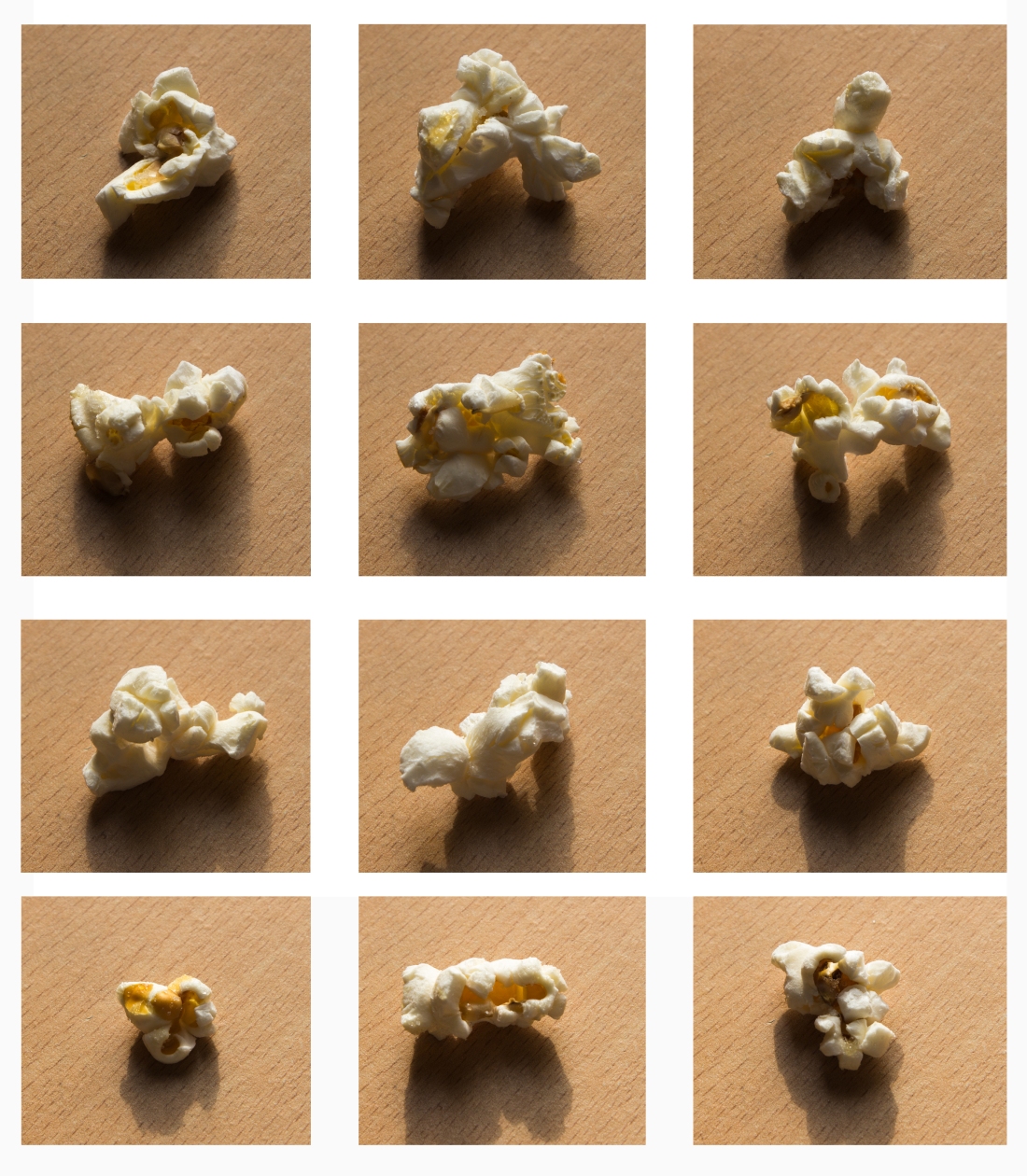
Even though this is quite a simply typology you can see the difference between each piece of popcorn as non of them look the same. They all have there own individual shapes and forms, colour. One thing that the down point with this shoot is the shadows that have been casted onto the table. If I was to create this shoot or re edit it I would do it so there was no shadow produced from the popcorn.
Final Experimental
The final experimentation above shows all of the 12 images layered over the top of each other. With the popcorn pieces having different shapes and colours you are able to see aspects of all of the images rather than them over powering others. With has been down within the chocolate bar shoot. To me I believe that this would be a high quality typology that I could put forward for a final piece.
Grant Lagassick


The work of Grant Legassick’s links into the work of Idris Khan, the reason behind this is it is using the same technique of over layering a set of image over the top of each other. However with this artist he has a different reason for creating the images that are shown above. Grant Lagassick studies urban environment and uses multiple images over layered to give the impression of a fine delicate pencil drawing. When coming across his work I straight way thought about how it is a similar way of working to Idris Khan, but it has more detail within the images as they are not as they are the same place within some but others have completely different places involved in them. With the examples I have included above it shows four different examples of his work. Out of the four I am most drawn to the first one, I am drawn to the colours, how they all have blended well together. Think that stands out in this image is the colours of blue as they have a contrast with the buildings that are surrounding the main busy road in London. For theses images there is another way that they could be created this is by moving your lens when taking the image having it on a long exposure time and then it would create the effect similar to the examples of Grant Legassick’s work.
Sixth Typology (15/03/2018)
This typology was one I have created while doing other topics work, I have included this as when taking the photographs of the Nuts and Bolts, I began to look in detail at the quality of each of them and how they differ with size and colour. I have created a small typology looking at a few of the nuts that I was photographing.
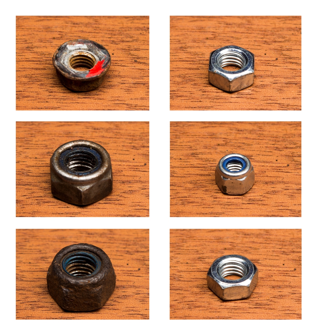
Even with this just being an unplanned shoot/typology I have still made sure that I have used the grey card to get the colours looking the same throughout the shoot. This is one of the shorter typologies I have completed as it was not planned so I did not have enough nuts to do a full 9 image typology.
Experimental Final Image
Before creating the final experimental piece for the nuts and bolts I knew that you would not be able to see to bigger of a difference between each other as I would make sure that I lined up the boult centre so the screw part was in the same place. You would only be able to see a small part of the change in nuts depending on how I over layered them together. Below shows the final experimental piece.
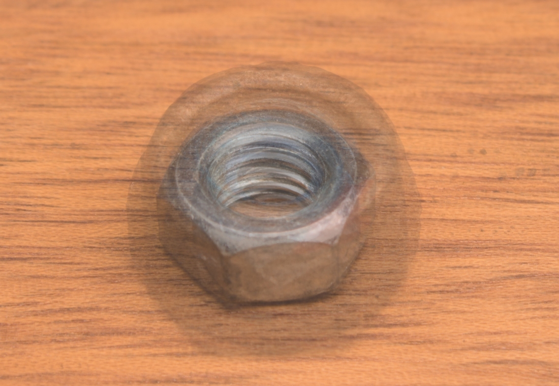
In my opinion this experimental is the worst out of the ones I have created, it does not stand out like the rest of them do. It has ended up looking like there are only two or three nuts within the photograph making it not looking interesting for the audience. I will not be using his as a final experimental for this reason, I will be picking one of the experimental image I have created before which are of a higher quality.
Artist – Jeff Brouws
While doing more research about typology I have come across the photographer Jeff Brouws. With this photographer I have included him as he has looked at similar details to what I have with a few of my images. His work can link back to my key and popcorn typologies, it may not be an obvious link. However I have linked it to Jeff Brouws work by it being the same thing being photographed but with different details involved. For example with the key typology they are all the same item as in keys but when looking at the detail they have all changed by having different cuts and groves cut into the key. This more links into the second example I have of Jeff Brouws work with the pick up trucks they are all the same type of car but with different colours painted on the trucks making them unique is there own way as non will ever be exactly the same much like a key as there are many out their in the world. For the pop corn link, it links into the tract houses as they are all different sizes and colours non will be build exactly the same just like popcorn. No one could control the size of what a popcorn turns out to be much like a house there is strict regulation they have to follow but they will we be small differences within the colours or outside to the buildings.


Final Pieces
For handin we have been ask for 2 typologies and 2 photoshop experimental pieces. The two typologies had to be one formal and one informal, so for theses to meet the requirement I have chosen to go with my street signs and grouped chocolate bar typologies as theses to me both are informal. With the formal typologies I have chosen to use the key and popcorn.
Reason I have chosen the street signs as informal is because there is nothing controlled while shooting the images they all have different lighting in the photographs and the object that the typology is the same but the names of the street are different. If it was to be formal I would of photographed the same street sign in different weathers. With my other informal typology of the grouped chocolate bars, it is not in the tradition typology form where they are in a grid format they are all other in one shot stacked. It started of as an experimental piece, however when looking at it I thought it would work as an informal image but it being a different layout to the others.
With the formal typologies I have chosen the popcorn and key ones because they are well controlled and have the same lighting with the same camera settings photographed within a controlled environment where non of the aspects would of changed. Another point to them being formal is that I have used a grey card with both of them so that no matter if the natural light that I used changed the background of the colours in the image, they would all end up being the same tones no matter what.
The last thing we have been asked to include was two experimental overalled images, in the style of Idris Khan. (His work is included at the top of this page) We need to included at least two of our own images in the final hand in. I have chosen to use the key, popcorn and the street signs overlay I have not chosen theses as they are the same as the typologies which I have chosen as final pieces. I have chosen them as they are the best quality out of them all an they are all visually interesting to look at, as with them you can see all different layers within them. Rather with others that you can not see which individual layer they seem to blend into each other, making the image look less appealing to look at.
Test Prints
Now that I have chosen my final images I have created test prints of the main typologies that I think will either look darker once printed or some of the detail will disappear. Here are the test print edits that I have created to see what small tweaks would make the images look better for when hey are printed. 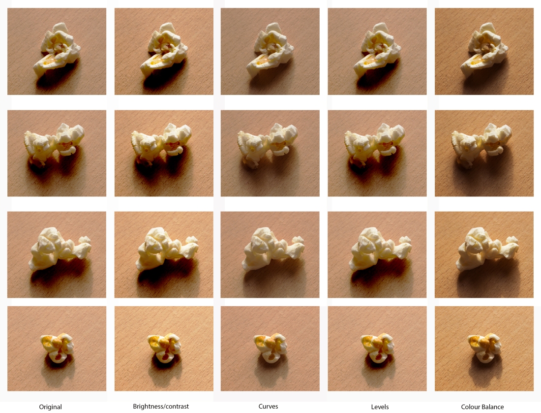
For the popcorn test strip I have decided to try a strip from the typology in four different edits, these are changing the brightness and contrast, curves, levels and the colour balance.
For the brightness and contrast with change the settings on this the shadows have become quite posterised and to dark from the original making the shadows not look correct. This effect has also accrued with the levels edit. From seeing how this edit has changed the image and the tones I would not be using this within the final print.
Curves has make the image brighter and bright back some lighter tones in the images, but in some way they have become slightly washed out making the image look softer when it is opened into photoshop. I did then try and change the clarity of the images but this only leaded into making it look to edited and unrealistic which was not my intentions. I would of used the curves for the final print if the quality of the image was not changed.
The last edit technique I have tried was colour balance, with this is has produced a warmer effect to the image making it have an orange cast over the image. This could of been because I changed the red and orange factors of the image to dramatically but when decreasing the orange colours it took out some of the tones within the table that the popcorn had been sat on. But on the other hand it makes the images as a set look more vibrant and bold rather than washed out.
With knowing these factors I will be keeping with the original and if the print does come out slightly darker I will trial it with a lighter and less dramatic edit with the colour balance adjustment, making it more of a subtle change rather than a dramatic change.
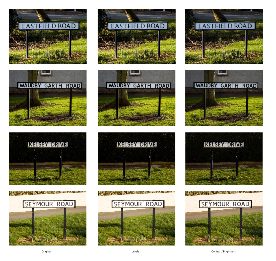
For the second test strip I have used the street signs typology as it has a range of different colours within the image that are quite dark and bold, with the edits I have chosen to do two tests one with levels and the other with contrast and brightness to make the dark parts more brighter so they do not let the street signs disappear into the background. In some this would not be the case as they have lighter colours behind them but with the ones I have included in the test strip they have all dark backgrounds.
With the levels I have tired to bring back more of the lighter tones into the image it has worked well with the bottom and top of the three image, however with the middle image all it has done as brought out the white in the sign rather than the over all colours in the image. Once looking at the other signs in the row of image I have realised that the wording with the bottom sign has started to lose the black tone to it, it looks as though it has started to fade out. With there being both of these small details wrong with this small edit I will not use the brightness and contrast as it has made the images loses the black colours in the signs.
Extra Experimental
While printing my final photographs I began thinking of what other things I could create by making a more unique type of typology. For this I have got back to the street signs typologies to see what other ways I could present them or to construct a totally different typology. For this I have two idea one being taking each of the signs close up and make them the only thing on the image and taking a letter from each of the street names and created a completely different worked out them. I would trial both of them to see what differences they have between them, also to see which idea would look more creative.
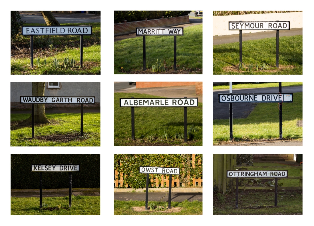
The first way I have tried is by stacking the actual street name above and below each other. By doing this I have create a typology in its self by the signs or the different street names that can be found. Below shows the final piece. 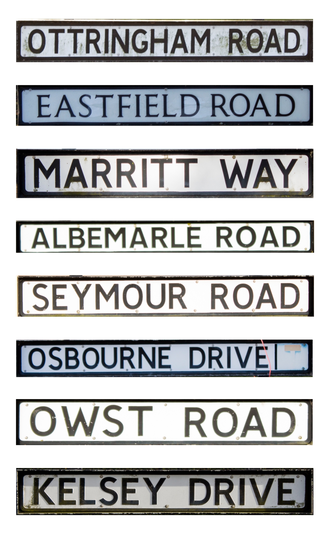
By creating this typology it has brought your attention more to the street names that we intended. It also makes you look more at the detail within the signs its self, by the quality of the sign how clean and how well looked after I has been. One thing that made me not like this image was by the different colours of the signs but in some way it adds to the uniqueness that they are not all the same.
The next one I have experimented with was the cutting out letters each sign to create a typology based on the actual letters so it ends up being a broken down from first being a full image showing the background and the sign to then the sign its self, now looking at the different style of lettering on the signs.

By creating this image it may not be the best editing that I could do with the image but at least it is showing the background of the letters, so you can see that with some the text font is different. With this factor we can see that there is a unique way that the people who has created the street names wanted to be seen as. This image is rough edit, but with it being rough it adds to the effect of the background around the letters as they are rough and dirty. To me even thought this image is not perfect it would work as a good title for the project as it is made up of a typology and has the word in it.
Overall Evaluation
For me this overall topic has been intresting as I have learnt a range of new skills with creating typologies. It has made me notice the smaller amount of details that are in the images. Before starting this topic I did not know much about typologies except that they are traditionally found in a grid format and there had to be a similarity thought the whole typology.
Now from completing this topic my understand of typologies are better, I have a better understand of what makes and informal and a formal typology. Such as with a formal typology everything you use, for example camera settings, lighting and product you are photographing. But with an informal typology you change everything about the images, taking the images in different location at different angles. For it to be informal you much of changed something with each photograph. That is why in my opinion my street signs are an informal typology with the factors of the lighting being different and when taking the photographs I had to change the settings of the exposure to take a certain amount of lighting so that the street signs would still be visible even though the sun is casting over the sign.
If I was to improve this topic I would do more research into the artists/photographers that have created typologies. Reason behind this would be that I could of created more visually interesting final pieces. It would of meant that I had a bigger variety of work. However with the work I have created I am happy with as they are well thought out rather than just rushing into taking photographs. One thing that I have enjoyed about this topic was being able to look at the small details that I never have noticed before when looking in photographs. It has also made me look into the sharpen of an image, as with it being a typology you see the smaller details between each image and you want to make sure the image has nothing that would stand out from the rest involved in the image.
Final Typologies – Informal
Final Typologies – Formal
Final Experimental Images
Bibliography
– http://www.tate.org.uk/art/artists/bernd-becher-and-hilla-becher-718 (15/02/2018)
– http://jamesmollison.com/books/where-children-sleep/ (15/02/2018)
– jamesmollison.com/books/the-disciples-work-test-1/ (15/02/2018
– www.saatchigallery.com/artists/idris_khan.htm (16/02/2018)
– https://www.creativeboom.com/inspiration/urban-etchings-artist-layers-multiple-images-to-give-the-impression-of-pencil-drawings/ (09/03/2018)
– http://legassick.art/bio/ _09/03/2018)
– https://www.artsy.net/show/robert-mann-gallery-jeff-brouws-typologies-projects-and-portfolios (25/04/2018)
